The environment a child inhabits during their formative years is often referred to by educators as the “third teacher.” While parents and educators provide the primary guidance, the physical and visual landscape provides the context in which all learning occurs. From the saturation of the colors on the walls to the clarity of the symbols on a cubby, every visual element sends a message. When these messages are intentional, they foster a sense of security, curiosity, and cognitive growth.
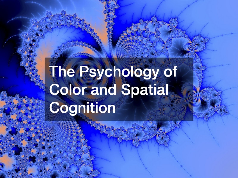
The Psychology of Color and Spatial Cognition
When designing a space for young learners, color is more than a decorative choice; it is a neurological tool. Different wavelengths of light trigger specific chemical responses in the brain. For instance, soft blues and greens have been shown to lower cortisol levels, making them ideal for areas dedicated to reading or rest. Conversely, vibrant yellows and oranges can stimulate the frontal lobe, encouraging verbal communication and physical energy.
In a high-quality daycare, the goal is to balance these stimuli to avoid “visual noise.” If a room is cluttered with too many competing primary colors, a child’s brain may struggle to filter out distractions, leading to fatigue or irritability. Designers focus on “zoning” through color—using neutral foundations with purposeful pops of brightness to signal the intent of a specific area.
Furthermore, local early learning centers often utilize these visual cues to aid in spatial navigation. Toddlers are still developing their sense of direction and logic. By using floor graphics—such as a “river” of blue tile leading to the bathroom or green “leaf” decals marking the entrance to a nature-themed play area—educators help children navigate their world independently. This autonomy is a cornerstone of early development, building confidence through successful environmental interaction.
Beyond simple navigation, the strategic application of mural art can transform a standard classroom into a thematic discovery zone. When walls depict realistic natural landscapes or soft, abstract patterns, it provides a “visual escape” that helps children self-regulate during stressful moments. This intentionality in environmental design ensures that the physical architecture of the room supports the emotional architecture of the child’s mind.
The integration of natural light also plays a pivotal role in how these colors are perceived throughout the day. A well-designed room considers the movement of the sun, ensuring that bright, active colors are placed where they catch the morning light to energize students, while darker, recessed corners utilize calming shades to provide a sanctuary for quiet reflection. By harmonizing artificial pigments with natural luminosity, designers create a living, breathing space that evolves with the rhythm of the school day.
Tactile Branding: Turning Apparel into Community

Human beings are hardwired for tribalism and belonging. For a young child, wearing a shirt that matches their peers and teachers provides a powerful sense of identity and safety. This is where the intersection of textile design and child psychology becomes evident. Beyond just a logo, the physical feel of the garment matters.
When schools partner with screenprinting services, the technical specifications of the print are paramount. For children, particularly those with sensory processing sensitivities, the “hand” (or softness) of the print is vital. Water-based inks or high-quality plastisol that has been properly cured ensure that the design doesn’t feel heavy or “scratchy” against the skin.
Moreover, the reliability of screen printing companies ensures that these visual markers of community remain consistent. A faded, peeling logo can subtly signal a lack of care or attention to detail, whereas a crisp, vibrant emblem reinforces the school’s professional standards. When faculty members wear coordinated apparel, it provides a “visual anchor” for children in busy environments, helping them quickly identify a safe adult to turn to for help or instruction.
The psychology of “uniformity” in early education is not about conformity, but about reducing social barriers. When every child wears a shirt with the same high-quality graphic, it eliminates visible markers of socioeconomic difference. This creates a level playing field where children can focus on collaborative play and shared learning experiences rather than peer comparison, fostering a more inclusive and empathetic classroom culture.
Additionally, branded apparel serves as a mobile ambassador for the school’s values during field trips and community events. When a group of students is easily identifiable through cohesive design, it simplifies supervision for staff and provides a sense of security for parents. This external visibility reinforces the school’s presence in the local area, subtly signaling to the community that the institution prioritizes both safety and a unified educational mission.
The Exterior as a Gateway to Trust
The journey of learning begins long before a child steps inside a classroom; it begins at the curb. For parents, the exterior of a building is a proxy for the quality of care provided within. A facade that looks neglected or institutional can trigger subconscious anxiety, whereas a bright, well-maintained exterior suggests a vibrant and nurturing atmosphere.
Engaging a professional painting service to refresh a school’s exterior is an act of communication. It tells the neighborhood that the institution is active, modern, and invested in its physical presence. Beyond aesthetics, the choice of paint plays a functional role in safety. High-performance, low-VOC (volatile organic compound) coatings ensure that the air quality around the building remains healthy for developing lungs, even shortly after a fresh coat is applied.
Strategic maintenance through a commercial painting company also addresses the psychology of “broken windows” theory. In an educational context, a pristine environment encourages students to respect the property. When the walls are clean and the colors are intentional, children are more likely to treat their surroundings with care. Professional painters can also incorporate “interactive” walls, such as chalkboard paint sections or magnetic finishes on exterior courtyards, turning a structural necessity into a canvas for daily discovery.
Consistency in the exterior palette also aids in community recognition and emotional anchoring. Using a specific “school blue” or “nurture green” on the building’s trim and entrance creates a visual landmark that children begin to associate with safety and excitement as they arrive each morning. This predictable visual environment eases the transition from home to school, reducing separation anxiety for both the student and the parent.
Furthermore, the choice of exterior materials and colors can reflect the local climate and heritage, grounding the school within its specific geographical context. By using earth tones in desert regions or brighter, reflective whites in coastal areas, a building demonstrates a thoughtful relationship with its environment. This architectural harmony teaches children, even at a subconscious level, the importance of context and the beauty of integrating human structures with the natural world around them.
Strategic Wayfinding and Safety Signage

In a large facility, the ability to find one’s way is a safety requirement and a developmental milestone. For pre-literate children, traditional text-heavy signs are useless. Therefore, effective design relies on iconography and “landmark” theory.
A specialized sign company understands that for a child, a “star” icon is more recognizable than the word “Office.” By placing signs at a child’s eye level—typically three to four feet off the ground—designers empower students to understand their environment. This practice reduces “transitional anxiety,” which occurs when children feel lost or unsure of where they are supposed to be during the school day.
Safety signage also requires a dual-purpose approach. It must meet strict regulatory standards for adults and emergency responders while remaining non-threatening to children. For example, fire exit signs are mandatory, but the surrounding wall can be designed with calming visuals to prevent the “scary” red signs from becoming a source of daily stress. A cohesive signage system bridges the gap between a high-security facility and a warm, inviting home-away-from-home.
Furthermore, high-contrast signage is essential for children with visual impairments or neurodivergent learners who may require more literal visual cues. By using textured signs or high-contrast color pairings—like black icons on a yellow background—an institution ensures that its environment is accessible to every learner. This commitment to universal design reinforces the message that every child, regardless of their physical or cognitive needs, has a place where they belong and can navigate with confidence.
Interactive wayfinding can also be incorporated into the learning curriculum itself. When children are taught to follow the “path of the sun” (represented by yellow wall graphics) to reach the lunchroom, they are engaging in a lived lesson about symbols and meaning. This turns the simple act of walking through a hallway into an exercise in logic and pattern recognition, proving that even the most functional elements of a building can serve an educational purpose.
Educational Collateral and Tangible Resources
While digital tools have their place, the “tactile-kinesthetic” learner needs physical objects to grasp abstract concepts. The weight of a card, the texture of a workbook, and the clarity of a printed diagram all contribute to how information is encoded in the brain.
Professional printing companies play a vital role in producing these “manipulatives.” When a child holds a flashcard with a high-contrast, high-resolution image, the visual cortex can process the information more efficiently than on a pixelated or low-quality print. The durability of these materials is also key; lamination and heavy cardstock allow for repeated use, which is essential for the “mastery through repetition” phase of early learning.
Furthermore, the use of graphic design services allows educators to create customized curricula that reflect the specific diversity and culture of their student body. Instead of relying on generic, one-size-fits-all posters, schools can develop visual aids that feature their own students, their own local landmarks, and their specific classroom rules. This level of personalization makes the learning material more relevant and engaging, as children see themselves reflected in the world around them.
Quality design in printed materials also extends to organizational tools for the educators themselves. When lesson plans, attendance sheets, and parent-teacher communication folders are professionally designed and printed, it reduces administrative stress. A well-organized visual system for the staff translates into a more calm and focused classroom environment, as teachers spend less time searching for materials and more time engaging directly with the children.
High-quality print production also ensures that color accuracy is maintained across different learning tools, which is vital for teaching concepts like color theory or biological classification. If a “red” apple in a book looks brown due to poor ink quality, it creates a cognitive disconnect for a young learner. Precision in printing removes these hurdles, providing a clear, undistorted window into the world of facts and figures that the child is beginning to explore.
Digital Presence and Community Storytelling

In the modern era, the “environment” of a school extends into the digital realm. Parents now interact with their child’s learning center through social media, websites, and digital newsletters. The visual storytelling used in these spaces is what builds the bridge between the classroom and the home.
A content marketing agency can help an educational institution translate its physical “vibe” into a digital narrative. High-quality photography of children engaged in “messy play” or focused on a STEM project tells a story of engagement that text alone cannot convey. When the digital visuals match the physical environment, it creates a “brand of trust” that reassures parents their child is in an environment designed for success.
This digital-physical synergy ensures that the school’s mission is visible at every touchpoint. Whether a parent is looking at a Facebook post or walking through the front door, the visual language—the fonts, the colors, and the imagery—should be a consistent reflection of the school’s commitment to child development.
By maintaining an active and visually compelling digital presence, schools can also build a supportive community of parents and alumni. Sharing success stories, developmental milestones, and behind-the-scenes glimpses of the learning process creates a transparent atmosphere. This transparency is vital in modern education, as it allows parents to feel like active participants in their child’s growth, even when they are physically separated by work or other commitments.
Moreover, a sophisticated digital strategy allows for the distribution of resources that parents can use at home to reinforce school lessons. By providing downloadable, well-designed worksheets or visual schedules that mirror those used in the classroom, schools extend the educational environment into the domestic sphere. This continuity of design helps children feel a sense of stability and purpose, knowing that the “rules of learning” remain consistent whether they are at a desk or at the kitchen table.
Conclusion
The visual landscape of an educational space is never neutral; it is either working for the child or against them. By treating every wall, every sign, and every t-shirt as a tool for development, we create a multi-sensory experience that supports cognitive, social, and emotional growth.
Designing for development requires a partnership between educators and visual experts. When we prioritize high-quality materials and intentional aesthetics, we do more than just “decorate” a room. We build a sanctuary for the mind, a place where the next generation feels inspired to explore, empowered to lead, and safe enough to dream. The investment in professional design is, ultimately, an investment in the potential of every child who walks through the door.