Key Takeaways
- Visual design focuses on creating a cohesive visual experience, while graphic design often centers on communicating a specific message.
- Both disciplines rely on principles such as balance, contrast, hierarchy, alignment, proximity, and repetition.
- Typography and color influence readability, mood, attention, and how audiences understand information.
- Graphic design is commonly used for posters, branding, advertising, packaging, publications, and other communication materials.
- Visual design often plays a larger role in websites, digital products, interfaces, and overall user experiences.
- Effective design balances visual appeal with clarity, purpose, usability, and the needs of the intended audience.
- Strong designers focus on purposeful decisions rather than adding decorative elements simply to make a project look attractive.
Design is everywhere. It shapes the websites we visit, the posters we see, the products we use, the spaces around us, and even the way information is presented. Because so many creative fields overlap, it can be difficult to understand where one type of design ends and another begins.
Visual design and graphic design are two terms that are often used interchangeably. While they share many tools, principles, and creative techniques, they are not exactly the same. Their goals, areas of focus, and typical applications can be different.
Understanding these differences can help artists, students, business owners, and anyone interested in creative work choose the right approach for a project. It can also make it easier to understand why some design decisions focus on appearance while others focus more strongly on communication, usability, or an overall experience.
What Is Visual Design?
Visual design is the practice of creating the visual appearance of a product, experience, or communication. It focuses on how something looks and how its visual elements work together to create a clear and appealing result.
Visual designers work with elements such as:
- Color
- Typography
- Shape
- Space
- Images
- Texture
- Composition
- Layout
- Visual hierarchy
The field can be broad. Visual design may be used for websites, apps, digital products, presentations, publications, signs, branding, and other experiences.
A visual designer is often concerned with the overall look and feel of a project. The goal is not simply to make something attractive. Good visual design helps people understand what they are seeing and guides their attention.
For example, a website may use a large heading, contrasting colors, and generous spacing to help visitors quickly understand the main message. Those choices are part of visual design.
What Is Graphic Design?

Graphic design is a broader communication-focused discipline that uses visual elements to communicate a specific message to an audience.
Graphic designers may create:
- Posters
- Brochures
- Advertisements
- Logos
- Packaging
- Magazines
- Business cards
- Social media graphics
- Books
- Signage
- Marketing materials
The purpose is often to communicate information, promote an idea, establish a brand identity, or encourage a specific response.
A graphic designer might be given a project such as a concert poster. The designer needs to make the poster visually appealing, but also needs to make sure the date, location, performers, and other important information are easy to find.
This communication goal is central to graphic design.
Visual Design vs. Graphic Design
The easiest way to understand the difference is to think about their primary focus.
Graphic design often focuses on communicating a specific message through visual media.
Visual design often focuses on creating a clear, cohesive, and appealing visual experience.
There is a lot of overlap between the two fields. A graphic designer uses visual design principles, while a visual designer may work on projects that also require graphic design skills.
The difference is often more about the context and goal of the work than the tools being used.
For example, both designers might work with typography and color. A graphic designer could use them to create a promotional poster, while a visual designer might use them to create the visual language for a digital product.
Their Shared Design Principles
Visual design and graphic design share many fundamental principles.
Balance
Balance describes how visual weight is distributed across a composition.
A design does not necessarily need to be symmetrical. Asymmetrical designs can also feel balanced when different elements are arranged carefully.
For example, a large image on one side of a page might be balanced by several smaller text elements on the other side.
Balance helps prevent a design from feeling unstable or confusing.
Contrast
Contrast creates differences between elements.
Designers can create contrast through:
- Light and dark colors
- Large and small text
- Thick and thin lines
- Different shapes
- Bold and regular type
- Large and small images
Contrast helps important information stand out.
A poster with no contrast may be difficult to read because everything has the same visual weight. A well-designed poster uses contrast to guide the viewer toward the most important information.
Hierarchy
Visual hierarchy tells viewers what to notice first, second, and third.
Designers can create hierarchy by changing size, color, position, spacing, and typography.
A headline is usually larger than supporting text. A call-to-action button may use a contrasting color. Important information may be placed near the top of a layout.
Hierarchy is especially important when a design contains a lot of information.
Alignment
Alignment creates relationships between elements.
Text, images, buttons, and other objects can be aligned along common edges or invisible lines. This creates order and makes the design easier to understand.
Poor alignment can make a composition feel messy even when every individual element looks attractive.
Proximity
Proximity means placing related elements close together.
For example, a heading should generally be close to the paragraph it introduces. A product image may be placed near its description and price.
This helps viewers understand which elements belong together.
Repetition
Repetition creates consistency.
A designer might repeat the same colors, fonts, shapes, or spacing throughout a project. This makes different parts of the design feel connected.
Repetition is particularly important for branding and multi-page projects.
How Their Goals Can Differ
Although visual design and graphic design share principles, their goals can vary.
Graphic design often begins with a communication problem.
A client might need to promote an event, explain a service, introduce a product, or communicate information. The designer’s job is to turn that message into an effective visual form.
Visual design may begin with a broader experience.
A designer may need to establish how an entire digital product, website, or visual system should look and feel. Instead of focusing on one piece of communication, the designer may think about how many visual elements work together.
This can include creating a consistent visual language that continues across different screens, pages, or touchpoints.
The Role of Typography
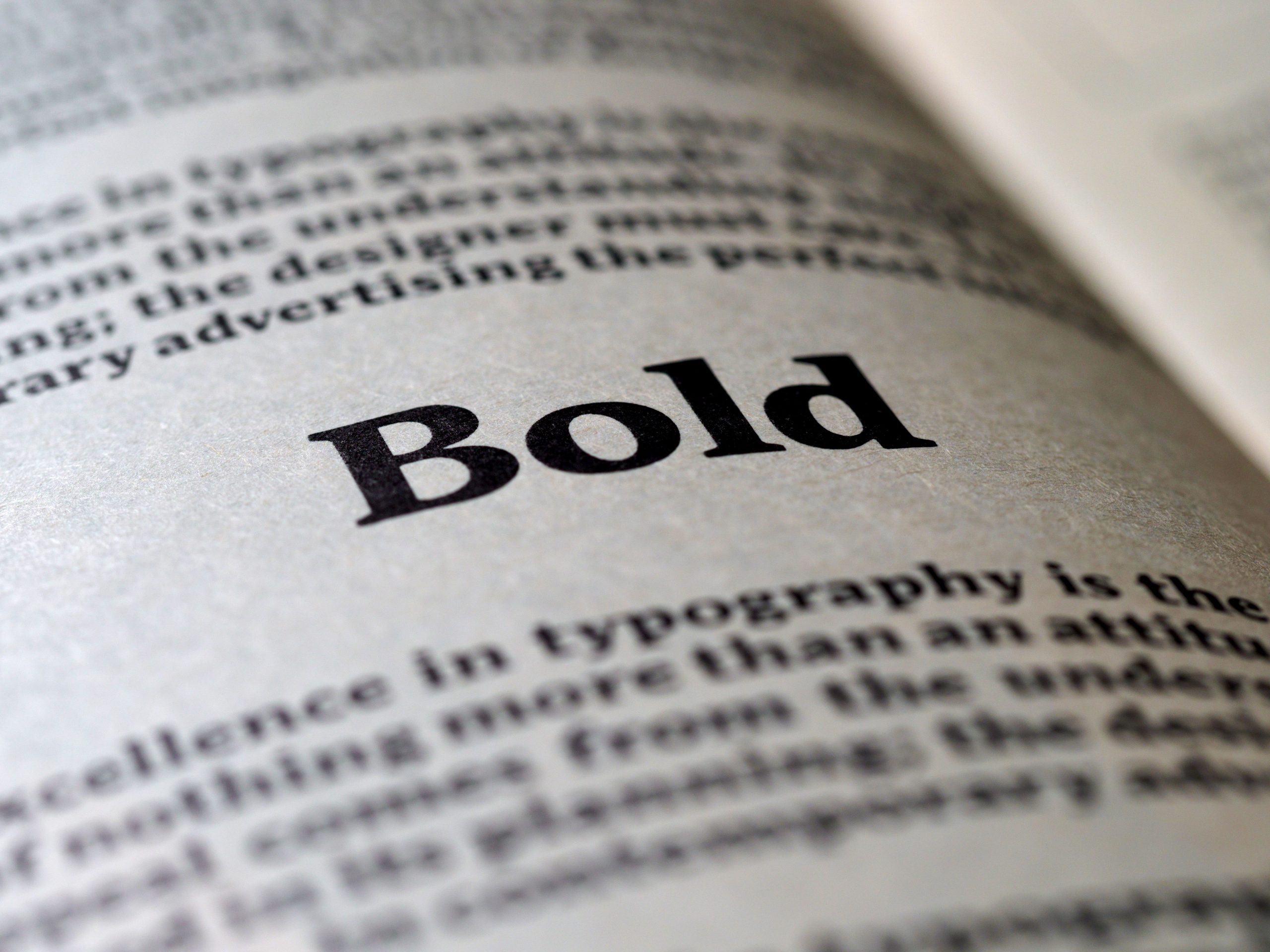
Typography is important in both fields.
Choosing a typeface is not only about selecting a font that looks good. Designers also need to consider readability, tone, hierarchy, spacing, and context.
A playful typeface may work well for a children’s art project but feel inappropriate for a law firm’s website.
Graphic designers often use typography to create a strong message within a fixed format. A magazine cover, poster, or advertisement may need to communicate its message within seconds.
Visual designers may think more broadly about how typography behaves across an entire system. They may establish rules for headings, body text, labels, buttons, navigation, and other elements.
In both cases, typography affects how people experience information.
The Role of Color
Color is another major area of overlap.
Colors can attract attention, create contrast, communicate meaning, and influence mood.
A graphic designer might use a bright color to make a promotional poster stand out. A visual designer might develop a complete color system for a website or digital product.
Color choices should also consider accessibility. Text needs enough contrast against its background to remain readable, and designers should avoid relying on color alone to communicate important information.
Good color choices support both beauty and function.
Visual Design and User Experience
One important difference becomes clearer when visual design is used in digital products.
A visual designer may need to think about what happens as a person moves through an interface.
For example, a button needs to look clickable. Navigation needs to be easy to recognize. Important information should be easy to find. Different pages should feel like they belong to the same product.
This means visual design can influence usability and user experience.
A beautiful interface is not automatically a good interface. If users cannot understand where to click or find what they need, the design has failed an important part of its purpose.
Visual designers therefore need to balance appearance with clarity.
Graphic Design and Communication
Graphic design has a strong connection to visual communication.
Consider a public safety poster. Its purpose is not simply to look attractive. It needs to communicate a warning quickly and clearly.
The designer may use large typography, strong contrast, simple images, and carefully planned spacing to make the message easy to understand.
The same principle applies to advertising, editorial design, packaging, and branding.
A successful graphic design piece communicates something even when the viewer spends only a few seconds looking at it.
How Design Supports Learning
Design also plays an important role in education and information sharing. Understanding the ways design supports learning can help artists and designers create materials that are easier to understand and remember.
For example, clear headings can organize information. Diagrams can explain relationships between ideas. Color can help separate categories. Images can provide visual context for difficult concepts.
However, adding more visual elements does not always make educational content better.
Too many colors, decorative images, fonts, or competing elements can make information harder to process.
Effective educational design removes unnecessary distractions and gives important information a clear visual structure.
Branding Connects Both Fields
Branding is another area where visual and graphic design often overlap.
A brand may include a logo, color palette, typography, photography style, illustrations, icons, packaging, website design, and marketing materials.
Graphic designers may create individual brand assets, such as logos and advertisements. Visual designers may help establish how the brand appears across a larger collection of digital and physical experiences.
Consistency is essential.
If a company uses completely different colors, typography, and visual styles across every platform, people may struggle to recognize the brand.
A strong visual system helps create a consistent identity.
Choosing the Right Approach for a Project
The best approach depends on the project’s goal.
Graphic design may be the better fit when you need a specific communication piece, such as a:
- Poster
- Flyer
- Advertisement
- Brochure
- Book cover
- Packaging design
- Marketing graphic
Visual design may be especially useful when you need to develop the overall appearance of:
- A website
- Mobile application
- Digital product
- Presentation system
- Visual identity
- Online platform
- Interactive experience
In many real-world projects, both disciplines are involved.
A website, for example, may need graphic assets, branding, illustrations, and marketing materials while also requiring a consistent visual system for the user interface.
Important Skills for Both Designers
People entering either field benefit from strong fundamentals.
Drawing ability can be useful, but it is not the only important skill. Designers also need to understand composition, color, typography, spacing, and visual communication.
Other valuable skills include:
- Creative problem-solving
- Attention to detail
- Research
- Communication
- Presentation
- Collaboration
- Basic technology skills
- Understanding of audiences
Software knowledge is useful, but software should be treated as a tool rather than the foundation of design.
A person can learn how to use a design application quickly. Learning how to make thoughtful visual decisions takes much longer.
How to Improve Your Design Skills
If you are learning visual or graphic design, start by studying existing work.
Look at posters, websites, books, packaging, signs, magazines, and artwork. Ask yourself why certain designs work.
Consider questions such as:
- What do I notice first?
- Where does my eye move next?
- Is the text easy to read?
- What creates contrast?
- How are related elements grouped?
- What mood does the color create?
- Is anything unnecessary?
- Does the design communicate its purpose?
You can also recreate existing designs as practice. This can help you understand spacing, hierarchy, typography, and composition.
Over time, focus on explaining your design decisions rather than simply saying that something looks good.
Avoid Designing for Appearance Alone
One of the biggest mistakes beginners make is focusing too heavily on decoration.
Adding more colors, fonts, illustrations, effects, or patterns does not automatically improve a design.
Every visual element should have a purpose.
Ask whether an element helps communicate information, guide attention, create consistency, establish emotion, or improve the overall experience.
If it does none of these things, it may not need to be there.
Good design is often about knowing what to remove.
Conclusion
Visual design and graphic design are closely related fields, but their goals can differ.
Graphic design is often centered on communicating a specific message through visual media. Visual design tends to focus more broadly on the appearance, structure, and consistency of an overall visual experience.
Both rely on core principles such as balance, contrast, hierarchy, alignment, proximity, repetition, typography, and color.
The boundaries between the two fields are not always strict. In modern creative work, designers often use skills from both disciplines. What matters most is understanding the purpose behind each design decision.
Whether you are creating a poster, developing a website, building a brand, or designing educational material, strong design should do more than look attractive. It should help people understand, navigate, remember, and connect with the information or experience in front of them.
That is what turns visual elements into effective design.